
Newsletter
July 2025
Winning Addy Awards is fun.
Getting together with the Pittsburgh advertising community is more fun.
We laughed, we might have even cried at the more emotional creative, and we for sure held our glass trophies from the Pittsburgh American Advertising Awards in April high. We led the city with 12 Addy Awards and picked up a District 2 Addy win to boot.
Held in Pittsburgh at Phipps Conservatory and Botanical Gardens, the theme “Relax, it’s only advertising” couldn’t have been more fitting for the Zen, spa-like atmosphere. And even though it is “only advertising,” it was tough to stay calm, cool, and collected when GH picked up awards on behalf of fantastic clients whose brands inspire us to create strategic, award-winning work.
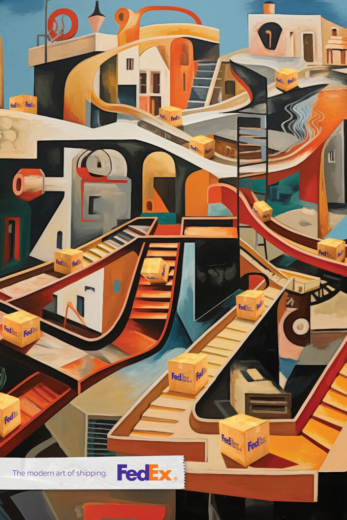
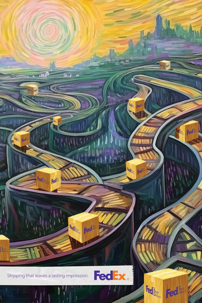
Winning at the District 2 level for our work for FedEx was also a thrill as D2 honors work from New York, New Jersey, Pennsylvania, Delaware, Maryland, and Washington, DC. And celebrating the great work that our friends and other agencies and organizations in the city produce is always a good time.
Until next year … #winanaddy!



Trends4Friends.
Influencer. Scientist. Soccer mom. Who are you calling an expert?
4 Context
TikTok experts, TED Talkers, podcasters, and political pundits receive increasingly more of our daily views. Their personalities and platforms make information more accessible than ever but also put more pressure on time-crunched people to determine who and what to trust.
So many of us tend to give equal weight to the “experts” in our feeds and front pages without really knowing their credentials. That can mean our real-life physical therapist, financial advisor, or PCP is competing with the self-proclaimed gurus, influencers, and thought leaders we engage with more frequently online.
The proliferation of “expertise” can have a massive impact on brands, too, because everybody has a voice, and hearsay often masquerades as fact.
2 Simplify
More content = more opportunities to become an expert = more reasons NOT to believe brand messaging.
What’s It All 4?
As a recent Big Think article stated, “A little learning is a dangerous thing, and there is no one more confident than someone who has read just a little bit about a topic.” Brands today must not only differentiate themselves from competitors but also combat the misinformation that devalues their industry overall.
- Don’t assume people trust what you have to say. Even your most loyal customers can fall victim to the last thing they’ve read.
- Focus on accessibility as much as expertise. Even expertise-driven industries like health care are facing more skepticism as people turn increasingly to content that is easier to understand.
- Invest more in the customer experience. When faced with conflicting viewpoints, people tend to default to their own lived experience as the only thing they can trust.
Remember: When expertise is easy to fake and attention is hard to earn, the only real authority is the one people choose to believe.

Donate Life 2025.
Colors, nature, and animation captured the “Let life sing!” theme perfectly.
National Donate Life Month, observed in April each year, helps raise awareness about donation, encourages Americans to register as donors, and honors those who have been donors.
This year, we were tasked with creating a vivid, moving, and inspiring video incorporating birds — one of the most welcome and visible signs of spring, representing both new beginnings and visits from loved ones who have passed away.
To make an impression, we combined the Donate Life color palette with the UPMC palette and punctuated a UPMC score with bird sound effects. We also paid special attention to bird videos to make the movements, particularly the wings, realistic. The result is a peaceful and hopeful celebration of donation.
Brands deserve modern love.
A little refresh can help a brand get its groove back.
When our friends at Adelphoi, one of Pennsylvania’s leading non-profit providers of services to at-risk youth and their families, came to us for some help with their brand and marketing materials, color palettes, iconography, fonts, and fun ensued.
We had some parameters, namely: the logo itself should remain unchanged, and we needed to keep the black, red, and white as the primary color palette. There were also some nice-to-haves, namely: a secondary color palette, new font suggestions, iconography, updated templates incorporating the new additions to the brand, and some direction on how we should use this brand properly throughout the organization — some sort of brand guide.
The result was a fun project with new brand elements that complement the existing brand and preserve its equity while giving it a modern look and feel that’s both flexible, refined, and memorable in every medium.